iheatmapr
iheatmapr is an R package for building complex, interactive heatmaps using modular building blocks. "Complex" heatmaps are heatmaps in which subplots along the rows or columns of the main heatmap add more information about each row or column. For example, a one column additional heatmap may indicate what group a particular row or column belongs to. Complex heatmaps may also include multiple side by side heatmaps which show different types of data for the same conditions. Interactivity can improve complex heatmaps by providing tooltips with information about each cell and enabling zooming into interesting features. iheatmapr uses the plotly library for interactivity.
While there are already plenty of awesome R packages for making heatmaps, including several great packages for making relatively simple interactive heatmaps (heatmaply and d3heatmap) or complex static heatmaps (ComplexHeatmap), iheatmapr seeks to make it easy to make complex interactive heatmaps.
Installation
To install the CRAN version of iheatmapr:
install.packages("iheatmapr")To install the github version of iheatmapr:
devtools::install_github("ropensci/iheatmapr")Example Complex Heatmap
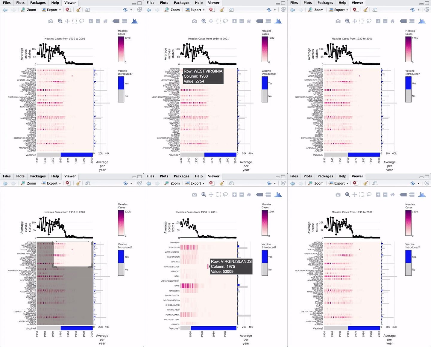
As an example of a complex heatmap, we can make a version of the famous vaccines plot from the Wall Street Journal that has been recreated in several other heatmap frameworks in R.
The code to create this heatmap is:
library(iheatmapr)
data(measles, package = "iheatmapr")

main_heatmap(measles, name = "Measles<br>Cases", x_categorical = FALSE,
             layout = list(font = list(size = 8))) %>%
  add_col_groups(ifelse(1930:2001 < 1961,"No","Yes"),
                  side = "bottom", name = "Vaccine<br>Introduced?",
                  title = "Vaccine?",
                  colors = c("lightgray","blue")) %>%
  add_col_labels(ticktext = seq(1930,2000,10),font = list(size = 8)) %>%
  add_row_labels(size = 0.3,font = list(size = 6)) %>%
  add_col_summary(layout = list(title = "Average<br>across<br>states"),
                  yname = "summary")  %>%
  add_col_title("Measles Cases from 1930 to 2001", side= "top") %>%
  add_row_summary(groups = TRUE,
                  type = "bar",
                  layout = list(title = "Average<br>per<br>year",
                                font = list(size = 8)))
Modular components of the plot are added in an iterative fashion to the top, right, left, or bottom of the heatmap. iheatmapr also contains a function (iheatmap) to make a fairly standard heatmap with optional dendrograms and row or column annotation heatmaps (See vignette).
All the plots aligned with the main heatmap horizontally share the same y axis and thus zooming in the y direction within the heatmap will also zoom in to those subplots. The plots aligned vertically share an x axis with that heatmap and zooming horizontally within those plots will be linked.
Hovering over the heatmaps yields a tooltip with the name of the row and column as well as the value represented.
Documentation
See the vignette for a more thorough introduction to the package.
Acknowledgements
This package includes the open source Plotly.js library, which does much of the work of making these interactive plots possible! In creating this package, I also drew inspiration & some code from the great plotly R package; in particular, the code for the iheatmapr htmlwidget is adapted from an earlier version of the plotly R package. Additionally, numerous people at Genentech helped provide feedback and guidance for this project, including but not limited to Justin Finkle, August Guang, Michael Lawrence, Gabe Becker, Steve Lianoglou, Pete Haverty... thanks to all who helped review code and/or provide feedback! This package also went through the on-boarding process for rOpensci -- thanks to the reviewers Carl Ganz and Andee Kaplan and editor Maëlle Salmon for all their helpful feedback!


