💧 Fluid System
Fluid System is a style props function transformer for generating fluid styles.
It is designed to be used with libraries built upon the System UI specification like Styled System or Rebass, and a CSS-in-JS library such as styled-components or Emotion.
What is Fluid Design? ⛲️
Fluid design is to responsive design what responsive design was to fixed layouts.
There is a greater need now, more than ever, for websites to adapt their designs to the plethora of devices existing in the market today. And to do so, most websites might follow a type size specification like below:
| Phone | Tablet | Desktop | |
|---|---|---|---|
| Screen width | ≥ 320px | ≥ 768px | ≥ 1024px |
| Font size | 16px | 19px | 23px |
The approach to implementing this with responsive design has been to create a breakpoint at each point of transition. But such an approach alienates a likely majority of your users whose screen sizes do not align exactly with those sweet spots.
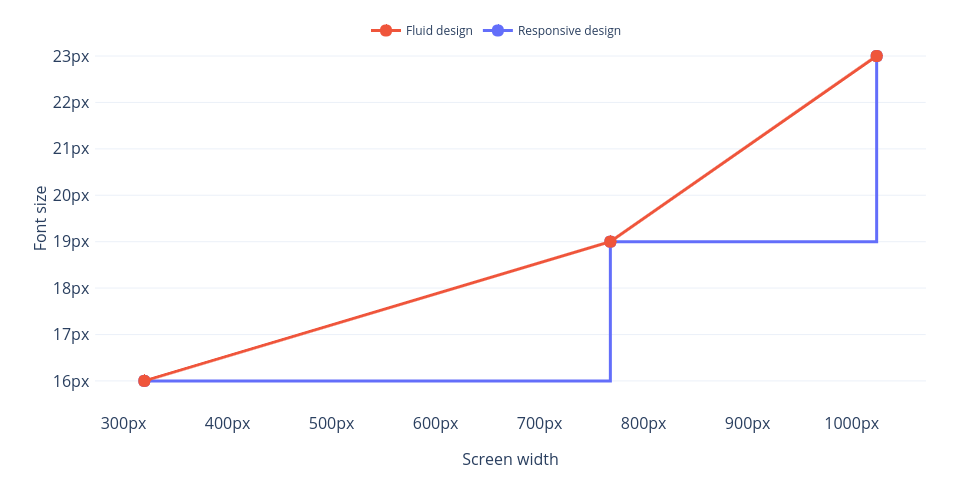
Take for example, a device having a viewport width of 767px. With a responsive design approach, it would be served a font size of 16px when—being just 1 pixel away from our 768px breakpoint—it should be getting something much closer to 19px.
Fluid design aims to bridge that gap by interpolating between those defined size measurements based on the width of your user's screen.
The graph below (red line) illustrates a fluid design implementation for the type size specification above:
This technique extends beyond just font sizes and can be used with any CSS lengths scale in your design, like a space scale for margin and padding, or even a scale for sizes to control width and height.
You can read more about the technique here.
Quick Start 🏊♀️
Convinced? Install Fluid System on your project.
npm install fluid-system
Make sure your breakpoints and the scales you wish to use in your design are defined in your theme object. Then, define a fluidStart alias on your breakpoints.
// theme.js
const theme = {
  breakpoints: ["768px", "1024px"],
  fontSizes: [13, 16, 19, 23, 27, 33, 39, 47]
};

theme.breakpoints.fluidStart = "320px";

/* You can also define theme.breakpoints as an object.
theme.breakpoints = {
  fluidStart: '320px',
  0: '768px',
  1: '1024px'
};
*/

export default theme;
This will define the viewport width at which your styles will begin to become fluid. Below that, they will remain fixed at the smallest sizes they have defined.
fluidStartis set to320pxby default (or20em/remdepending on what unit yourbreakpointsare defined in).
Then, make sure your theme is available to your component tree via a ThemeProvider, otherwise Styled System will not be able to pick up on your theme values.
import React from "react";
import { ThemeProvider } from "styled-components";
import theme from "./theme";

const App = () => (
  <ThemeProvider theme={theme}>{/* Your component tree */}</ThemeProvider>
);

export default App;
Now, in your base components, wrap the Styled System functions (or your custom style prop functions) that you want to make fluid with the fluid function.
fluid transforms style prop functions to make all the responsive styles they have defined in CSS lengths fluid.
import React from "react";
import styled from "styled-components";
import { typography } from "styled-system";
import fluid from "fluid-system";

const FluidText = styled("p")(fluid(typography));

const MyComponent = () => (
  <FluidText fontSize={[1, 2, 3]}>Hello, world! I'm fluid!</FluidText>
);
FluidText in MyComponent will now fluidly scale between 16px, 19px, and 23px in line with your theme's defined fontSizes and breakpoints.
< 320px* |
≥ 320px* |
≥ 768px |
≥ 1024px |
|
|---|---|---|---|---|
typography |
16px |
16px |
19px |
23px |
fluid(typography) |
16px |
16–19px |
19–23px |
23px |
* theme.breakpoints.fluidStart
Requirements ☔️
Because of the way linear interpolation calculations work, all measurements at play—your theme's breakpoints, and all the sizes you wish to transition between—will need to be defined in the same unit.
For example, if your breakpoints are defined in px, you will need to use px measurements in your styles for Fluid System to work its magic. Styles defined in different units will not have fluid styles generated.
Interpolating Across Breakpoints 🚣♀️
Fluid System follows the Styled System syntax for skipping breakpoints. For fluid styles, it can also be used to interpolate styles across breakpoints. Just set null between two values in your array and Fluid System will skip over defining a new size at that breakpoint and instead smoothly scale between the endpoints as if the middle breakpoint had not been defined.
<Text fontSize={[1, null, 2]} />< 320px* |
≥ 320px* |
≥ 768px |
≥ 1024px |
|
|---|---|---|---|---|
typography |
16px |
16px |
19px |
|
fluid(typography) |
16px |
16–19px |
19px |
* theme.breakpoints.fluidStart
Usage with Rebass 🤽♂️
Fluid System works just the same with Rebass! Just note that you may need to install Styled System separately, or some of its base style prop functions, if you haven't already.
npm install @styled-system/typography
import styled from "@emotion/styled";
import { Text } from "rebass";
import typography from "@styled-system/typography";
import fluid from "fluid-system";

const FluidText = styled(Text)(fluid(typography));


