The code for this component has moved to the main PWABuilder monorepo and this repository has been archived. Please visit our monorepo for the latest source.
pwa-install
Please use our main repository for any issues/bugs/features suggestion.
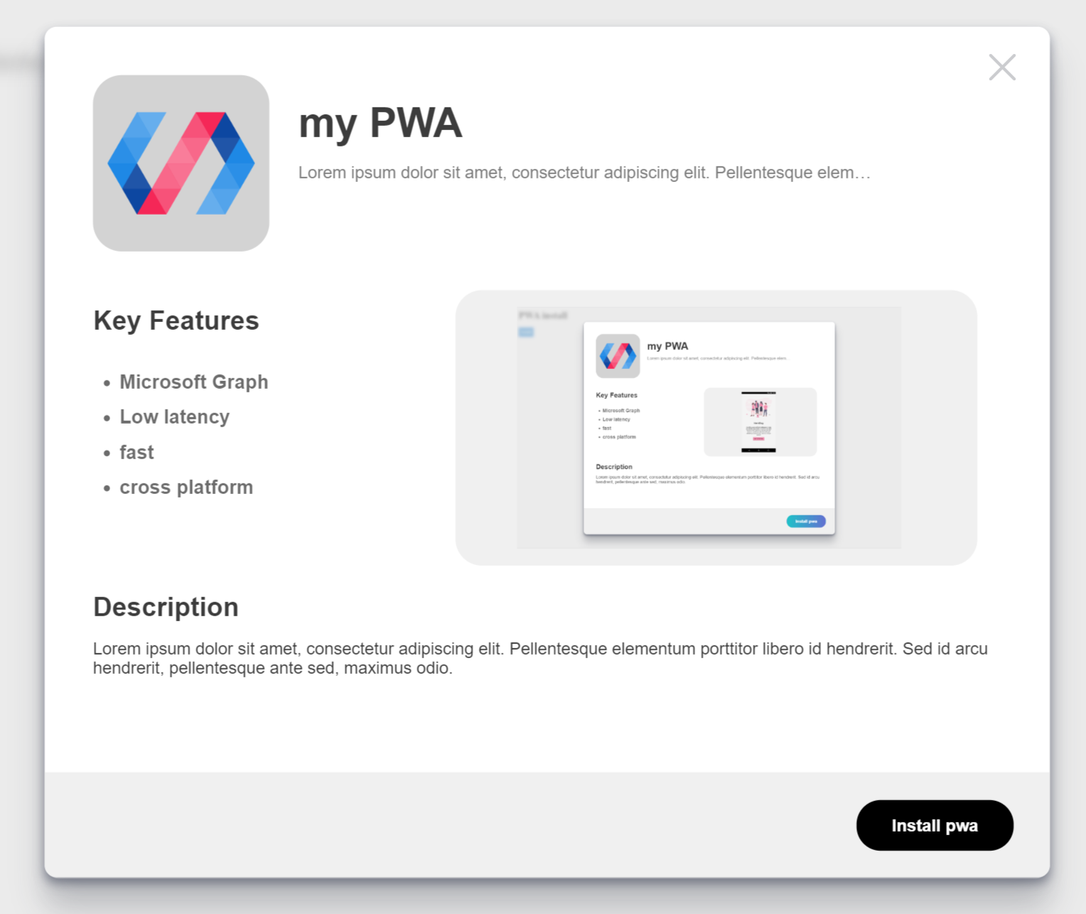
pwa-install is a web component from the PWABuilder team that brings an awesome "install" experience to your Progressive Web App!
Built with lit-element
What does it look like?
Supported Browsers
- Edge
- Chrome
- Firefox
- Safari
Using this component
Install
There are two ways to use this component. For simple projects or just to get started fast, we recommend using the component by script tag. If your project is using npm then we recommend using the npm package.
Script tag
- Put this script tag in the head of your index.html:
<script
  type="module"
  src="https://cdn.jsdelivr.net/npm/@pwabuilder/pwainstall"
></script>
NPM
- Run
npm install @pwabuilder/pwainstall - import with
import '@pwabuilder/pwainstall'
Then you can use the element <pwa-install></pwa-install> anywhere in your template, JSX, html etc.
live demo: https://pwainstall.glitch.me
API
Properties
| Property | Attribute | Description | Type | Default |
|---|---|---|---|---|
openmodal |
openmodal |
Controls the opening of the modal via attribute, consider using the function | boolean |
false |
usecustom |
usecustom |
Hides default button | boolean |
false |
manifestpath |
manifestpath |
path to your web manifest | string |
manifest.json |
explainer |
explainer |
Controls the text of the explainer text just below the title of the app header | string |
This app can be installed on |
featuresheader |
featuresheader |
Controls the text of the features header | string |
Key Features |
descriptionheader |
descriptionheader |
Controls the text of the description header | string |
Description |
installbuttontext |
installbuttontext |
Controls the text of the install button | string |
Install |
cancelbuttontext |
cancelbuttontext |
Controls the text of the cancel button | string |
Cancel |
iosinstallinfotext |
iosinstallinfotext |
Controls the iOS installation info text | string |
Tap the share button and then 'Add to Homescreen' |
Methods
| name | Description |
|---|---|
openPrompt() |
Opens the install modal |
closePrompt() |
Closes the install modal |
getInstalledStatus() |
Tell if the PWA is installed or not |
Interactions with the methods requires a reference to the element itself, if using webcomponents or a library like Lit-Element or Fast-Element, this can be done easily within the if using the component from the browser
Styling
CSS Variables
We recommend using our CSS variables to easliy tweak the style of this component to fit your project. Here are our current supported CSS variables.
| name | Description |
|---|---|
--install-button-color |
Changes the color of the install button |
--modal-z-index |
Changes the z-index of the install modal |
--modal-background-index |
Changes the z-index of the install modal background |
--modal-background-color |
Changes the background color of the install modal |
Shadow Parts
If you need to style this component more comprehensively, you can use Shadow Parts to style both the install button and the install modal. To target these two elements you can use pwa-install::part(openButton) and pwa-install::part(installModal) respectively. For example, to make the background of the install button grey, I would need this CSS:
pwa-install::part(openButton) {
  background: grey;
}
Advanced Examples
Usage with typescript
import "@pwabuilder/pwainstall"; // module import, allows for use in templates.

class YourClass extends RenderLib {
  ...

  get installComponent(): PWAInstallComponent {
    return this.shadowRoot?.querySelector("pwa-install");
  }

  ...
}
Example with Component Reference (Web Components)
<template id="example">
  <style></style>
  ...
  <pwa-install></pwa-install>
</template>customElements.define(
"example",
class Example extends HTMLElement {
constructor() {
super();
let template = document.getElementById("example");
let templateContent = template.content;
this.shadowRoot = this.attachShadow({ mode: "open" }).appendChild(
templateContent.cloneNode(true)
);
this.installComponent = document
.getElementsByTagName("el-example")[0]
.shadowRoot.querySelector("pwa-install");
}
}
);Example with Component Reference (Lit-Element)
// Using module import
import { LitElement, html, property, query } from "lit-element";
import "@pwabuilder/pwainstall";

class Example extends LitElement {
  @query("installId") componentRef: HTMLElement;

  render() {
    return html`
      <body>
        <pwa-install id="installId"></pwa-install>
      </body>
    `;
  }

  interactionWithComponent() {
    // See the methods section
    this.componentRef.getInstalledStatus();
  }
}
Example with Component Reference (Fast-Element)
const template = html`
  <pwa-install ref('installComponent')></pwa-install>
`

@customElement({ ... })
class Example extends FASTElement {
  @observable installComponent: PWAInstallComponent | undefined;

  @volatile
  get installComponent() {
    return this.shadowRoot.querySelector("pwa-install");
  }

  interactionWithComponent() {
    this.installComponent.getInstalledStatus();
  }
}
Example of grabbing from the dom
<head>
  <script
    type="module"
    src="https://cdn.jsdelivr.net/npm/@pwabuilder/pwainstall"
  ></script>
</head>
<body>
  <pwa-install id="installComponent"></pwa-install>
  <script async defer>
    const ref = document.getElementById("installComponent");
    ref.getInstalledStatus();
  </script>
</body>
Example of programmatically creating the element
<head>
  <script
    type="module"
    src="https://cdn.jsdelivr.net/npm/@pwabuilder/pwainstall"
  ></script>
</head>
<body>
  <script async defer>
    var installComponent = document.createElement("pwa-install");
    document.body.appendChild(installComponent);
    installComponent.getInstalledStatus();
  </script>
</body>